CPR Training AR App
Teaching kids lifesaving skills through Augmented Reality
CPR stands for Cardiopulmonary Resuscitation, a life-saving emergency procedure. We wanted to help kids learn this technique to become potential lifesavers.
- Type
- UX/UI · App design
- Role
- UX designer, interface designer
- Timeline
- 10/2020 – 01/2021
- Tools
- Photoshop, Illustrator, AfterEffects, PremierePro, XD
- Team
- Dominik Dumberger, Martin Ferstl
Overview
Problem
Countless examples demonstrate that children can save lives by performing CPR. In 2009, ABC News reported that children as young as 9 years old can learn the basics of CPR. That means that young kids can learn and perform CPR but due to the lack of ways to teach them this technique, we had to come up with a digital solution.
Solution
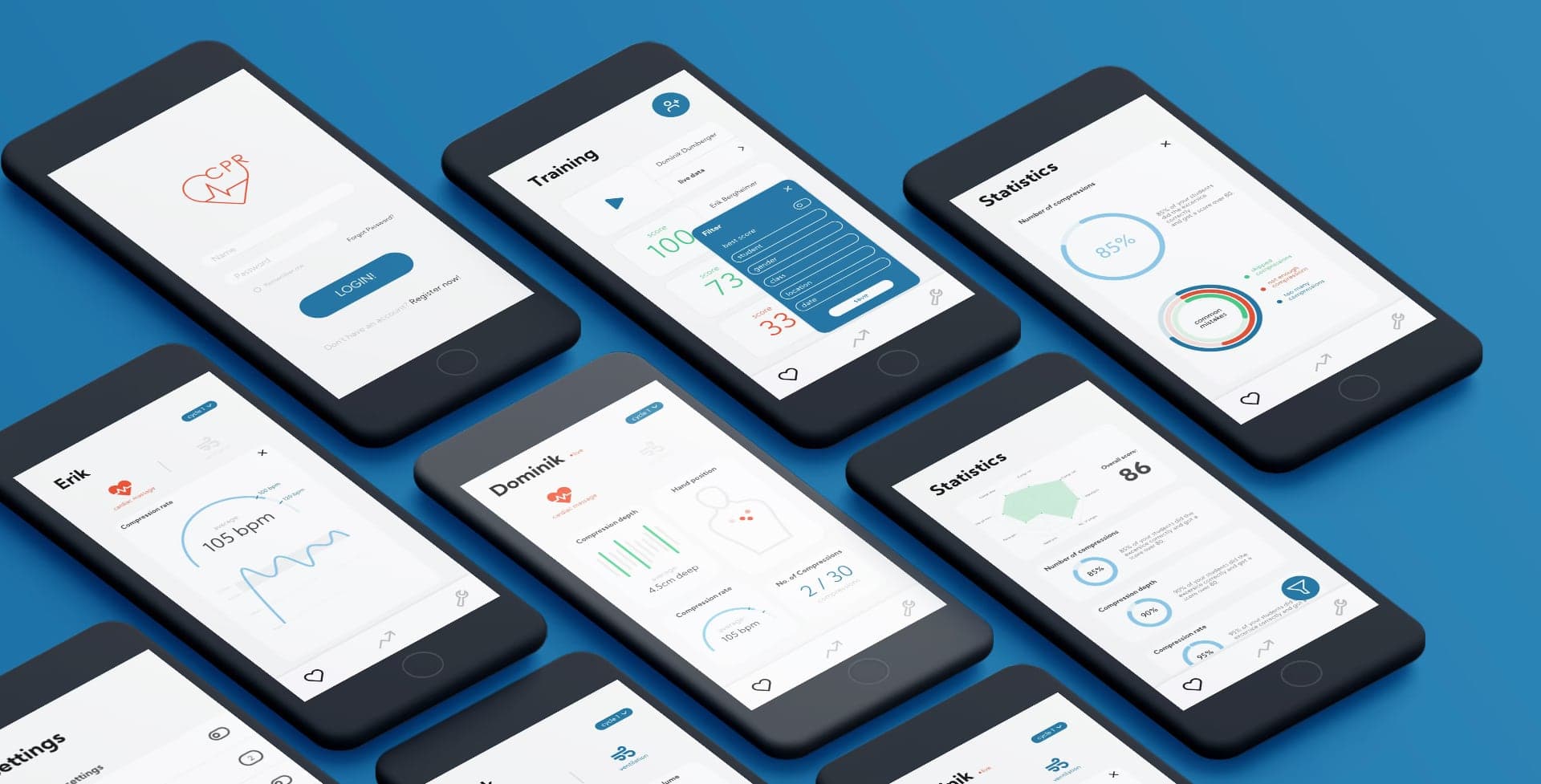
We decided to design two different apps, one interface for the CPR teacher, who's gonna use a smartphone and one interface for the kids. In our case we came up with the idea of using AR goggles for the kids, so the interface for the kids should be an AR interface.
Our Process
- Preparing Phase: Brainstorming, Personae, Paperprototyping, Moodboard
- Designing Phase: Wireframes, Digital prototypes
- Finalizations: Storyboard, Movie, Conclusion
Preparing Phase
Brainstorming
The very first step, when we first met in October 2020 was to brainstorm about this topic and doing a lot of research on CPR. At the very beginning we came up with a lot of ideas e.g. using multiple iPads for the kids but then the idea of an AR experience for the kids came up. With these type of AR goggles on, it would be possible to perform the training for the CPR technique, while the AR interface could give the kid useful informations about his or her training. It was very important for us, that we only display the most important informations on this interface.
Personae
The next step in our project was to define our target group with creating Personae. A persona symbolizes a prototype for a group of users and has personal habits, characteristics and usage behaviours.
On the one hand there's Amy Average, a typical 13-year-old girl, very extrovert, loves school because she can talk to her friends. She represents an unmotivated target group. Then there's Cooper Curious, a super motivated boy who wants to learn and help people, but introverted.
On the other hand there's Holly Helpful, a middle-aged medic, very good at CPR but not tech-savvy. And Arthur Ambitious, a very young teacher, a tech nerd but not great at CPR techniques.
Paperprototyping
The next step in our UX process was to create first ideas of an interface. Drawing raw sketches on paper is a very effective and fast method to create ideas before starting to design too early in a prototyping tool.
We started sketching and creating some ideas of how our app could look like. The first picture shows our first raw ideas and layout concepts. The second picture shows our final paper prototypes for the AR app and the third our final idea for the teacher's app.
Moodboard
The last step in the preparing phase was to create a moodboard. A moodboard is a very important tool in design processes. It helps to get a hint of how the final project will look like.
In our case, we had to design three different moodboards: one with only adjectives, one with general images like nature, architecture etc. and one with user interfaces only. With awesome tools like Dribbble and designinspiration.com we found some great example pictures.
Designing Phase
Wireframes
The first step in the designing phase is creating wireframes! Wireframes are sketches that are a lot more precise and exact than raw paper prototypes. After creating our paper prototypes, we got feedback and changed some details.
An important part was thinking about interactions between the different screens: "Which button has to be pressed to get to this screen?". We connected the screens and used orange stickers for links to other screens and green stickers for animations on the same screen.
Digital Prototypes
Now that the content and the interactions between the screens were done, we could proceed with going digital! Digital prototypes are realistic enough to test most of the interface elements.
Under all the different prototyping tools like Figma, Framer or InVision we picked Adobe XD, because the collaboration with Adobe Illustrator and Adobe Photoshop is a lot better than with other common tools.
Finalizations
Storyboard
Now that our digital and clickable prototypes were done, we could proceed with the last steps. To explain the different use cases of our app, we had to create a movie. It's always useful to plan your story before you film it, so we started creating a storyboard.
A storyboard provides a schematic overview of the basic structure of the project. The most important questions: When and where does the story take place? In which order do events happen? What are the screens we want to show?
Final Movie
The very last step was to film and cut the final movie about our project. The duration was only two minutes so we had to make sure the information was presented quickly. We created our movie in Adobe Premiere Pro and the animations in Adobe After Effects.
Special thanks to Jonas Fischer for acting, to Anja Happernagl for lending us the mannequin and to the Evangelische Gemeinschaft Königsbrunn for the rooms!
Conclusion
We think we learned a lot during this project! We started with brainstorming and were really excited. Drawing sketches, a very important part of UX processes, was something we struggled with at first.
Due to the Covid-19 pandemic, this project was very special. At first we started with presence classes, but as soon as the shutdown was reality, we moved to online lessons. Despite this, the outcome was very good and interesting!
Related service: UX/UI Design